Ever wondered how, when you check the time to reach a place on Google Maps, it shows you one time only for it to end up taking longer by the time you actually leave and get there? Google Maps is taking a baby step in addressing this problem with its latest update.
The latest update to Google Maps will now show a time graph when the distance to a particular location is checked. The graph can be accessed by tapping the Route Info option that shows up at the bottom when searching for directions to a particular location. While the exact times are not shown, the time graph gives you and idea of how much slower or quicker you’d reach your destination if the time you left varies. Technically, the desktop version of Maps did support a related feature by allowing you to choose the time of the day you left (and also the day / date themselves) although it would show a wide range of from and to times which weren’t really as helpful as the current update poises to be.
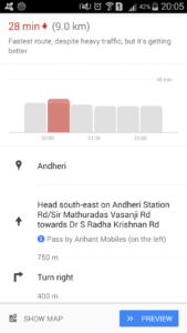
The Time Graph shows the current time along with travel times for some future start-times.
The update was initially rolled out to the US and UK although it seems to be live in all markets. We checked this in India for a sample route and the time graph did indeed show up, depicting how the time to journey would vary based on the time of departure. To get this feature on your Android phones, update your Google Maps to the latest version. No word on whether this is out for iOS as well; if someone is familiar with it, do drop in a comment below.