Google uploaded, then removed a new video on its upcoming Material Design. Twitter however, was quick to catch it and make some copies before it got completely wiped off. The video demonstrates several aspects of the material UI standard that Google is increasingly looking to incorporate into its products. We’ve already seen a taste of it with the redesigned Google Maps app as well as updates to years-old designs of Google Drive and Gmail. Here’s the video; it doesn’t contain any audio.
https://twitter.com/RaminNasibov/status/1021716840710656001
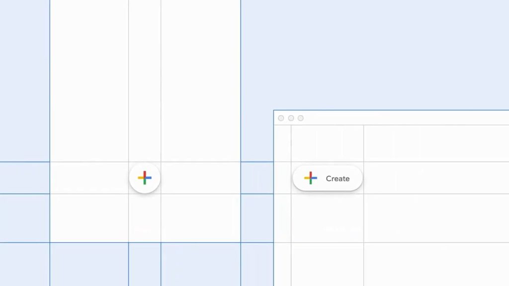
Right off the bat, we see that the create button is now at the center. This is likely to translate into a centralized action button for such tasks as creating a new folder or uploading a new file in Google Drive, composing a new mail in Gmail among other things.
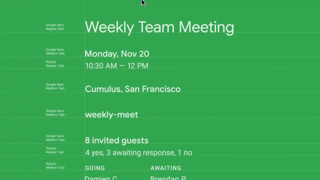
The font is undergoing a change as well. Google Sans is set to become the new standard, possibly alongside Roboto in certain situations. The video contains examples of how the two look side-by-side along with variations in size.
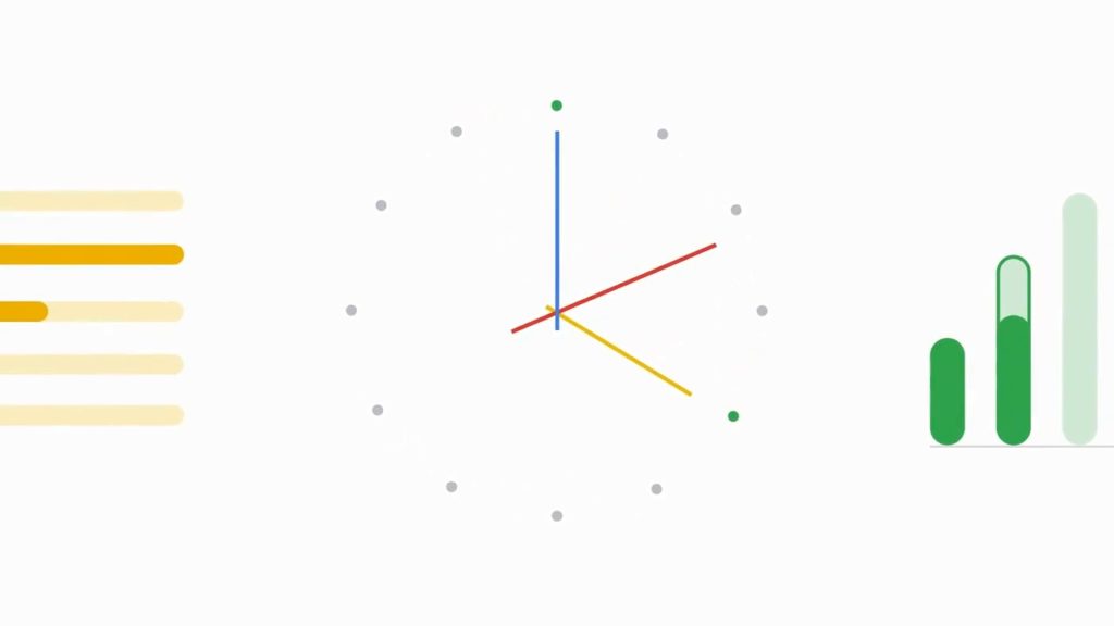
The UI gets new icons and some bright colors to boast of. Alongside the default blue, red, yellow and green will arrive to the rescue to provide a hefty color bank. Overall though, the look is largely whitish and one hopes a black night mode will be one of the options provided.
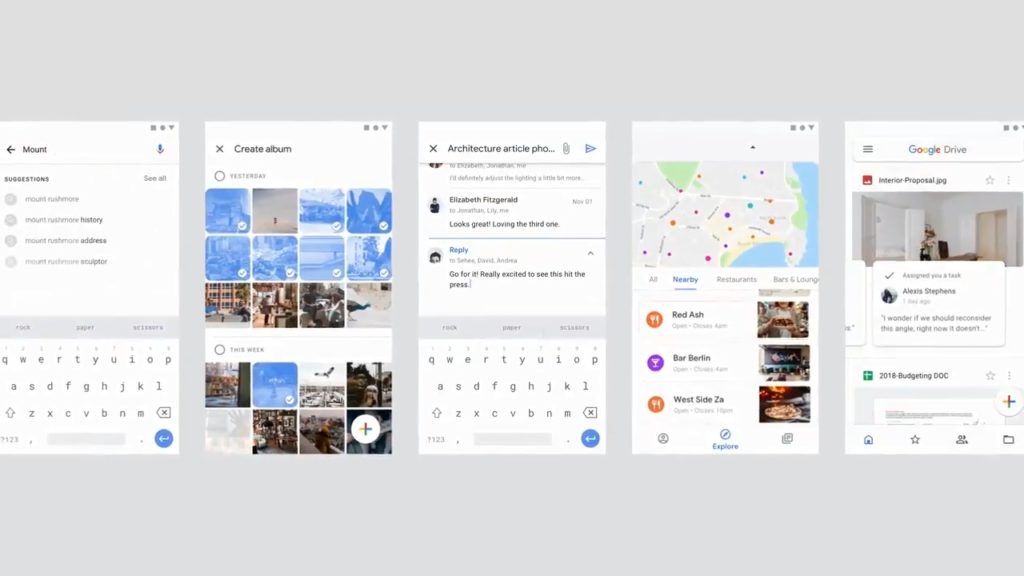
Finally, here’s a look at some of the apps in action when using the new Material UI.
We’re unsure as to when Google will make this official but if we were to wager a guess, it would be in about two months, around the time of the Pixel’s rumored unveiling. That will also be just about the time Gmail’s new design beta will end meaning by then, everyone would have migrated to the new Gmail.


